
A local insurance agency came to me for help attracting a wider audience to their business. Their initial ask was for help with advertising via social media. After auditing their digital footprint, I made the recommendation of a multi-step plan that first called to expand and modernize their digital presence, ensuring that their advertising dollars could be used effectively in the future.
UX design, UI design, Brand Strategy, Copywriting, Project Management (procure and manage development partners)
Alongside a thorough review of the client's existing website, the discovery phase included:
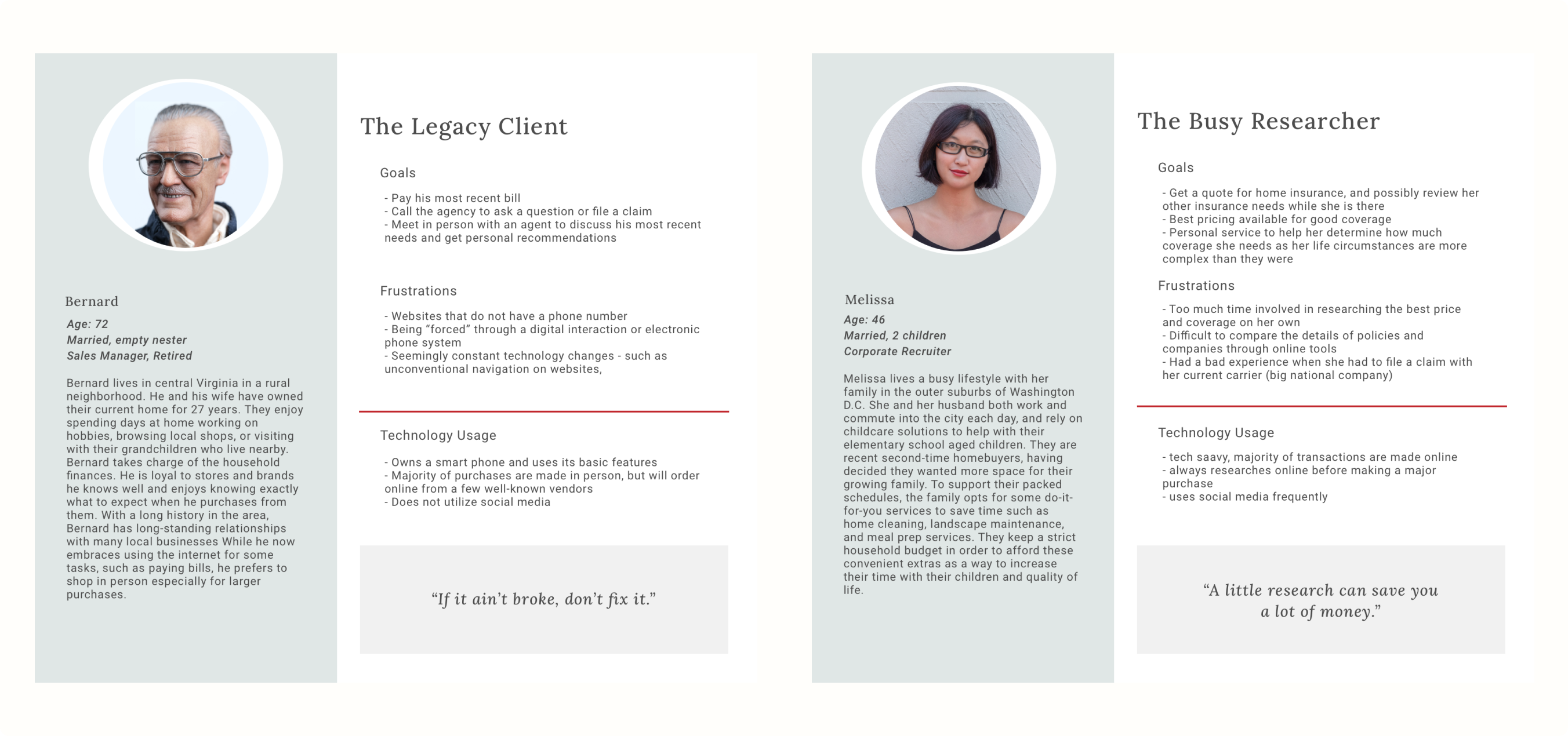
Insights gained from this research were used to define and prioritize project goals and create a feature roadmap. Two personas were developed to represent the existing client base and the aspirational new audience the brand wishes to attract.
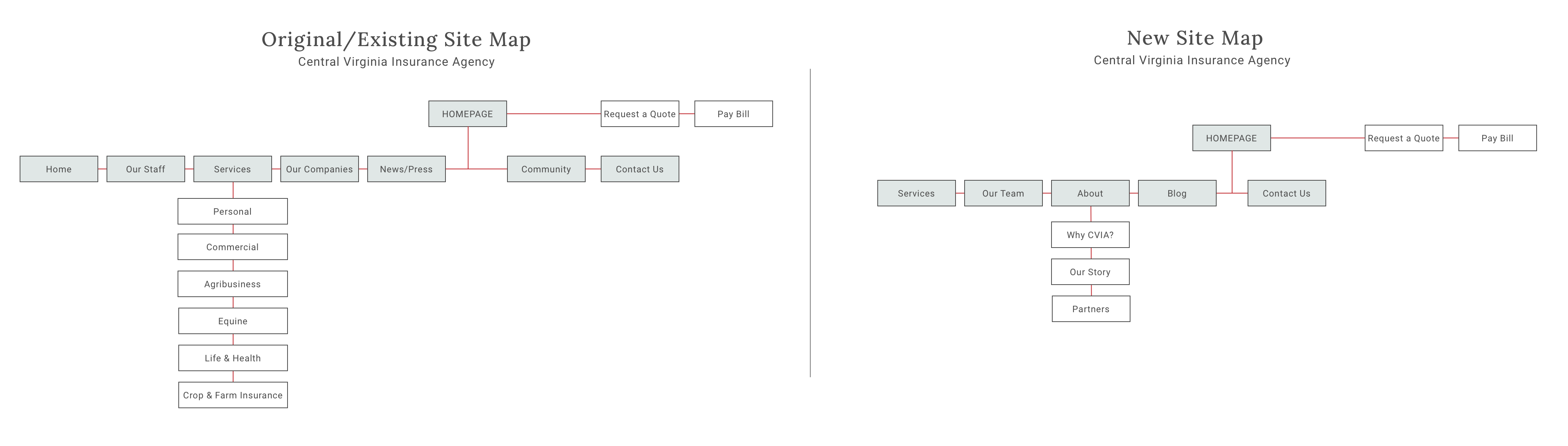
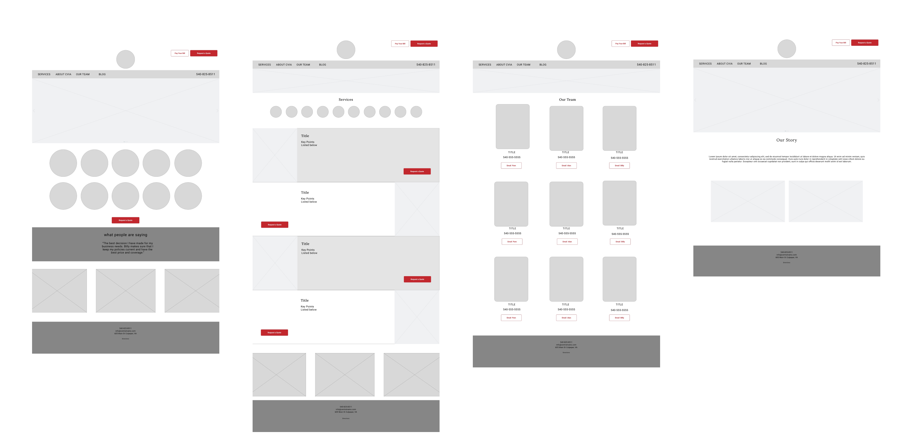
Site architecture and wireframes were established and presented to gain concensus among the project's stakeholders on the overall flow and goals of the site. Key actions included:
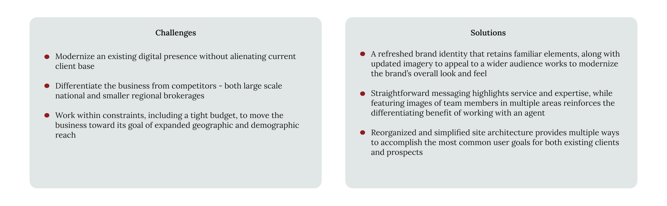
The challenge to refresh CVIA's logo mark was two-fold. Refreshing the brand's overall identity while maintaining recognition in the established market - without the need for a rebrand campaign - and blending with existing assets, such as signage. This created a way to help meet the needs of a small business to make changes over time to accommodate limited time and budget resources.
Solutions that addressed these constraints included:

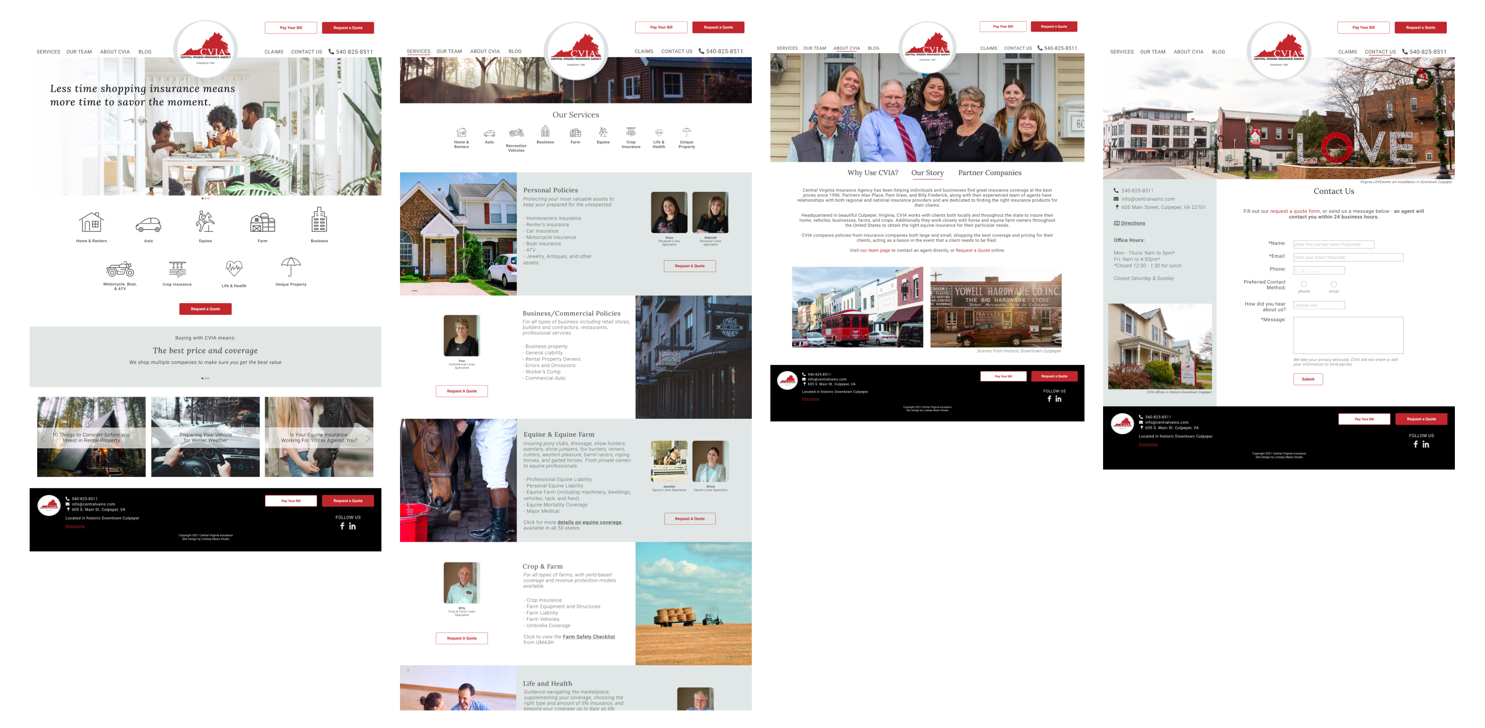
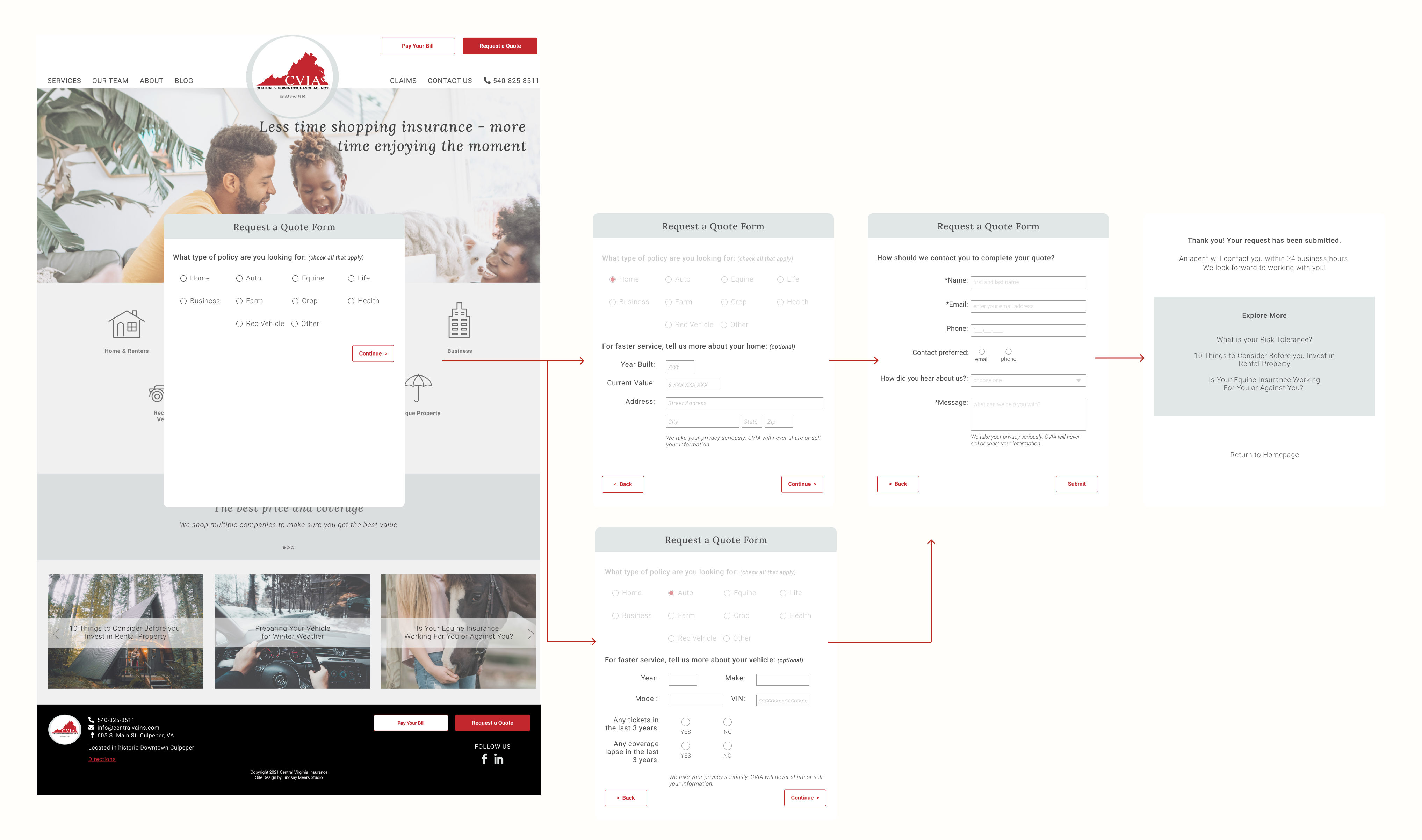
Recommendations for content included bringing more attention to individual agents to help establish the personal service clients receive and introducing a new quote request form that gathers more information, allowing agents to respond to inquiries more quickly. Emphasizing friendly, 'we do it for you' messaging throughout the site copy reinforces a key differentiator for the company when competing against larger, hands-off providers.
At the outset of the project, we determined that a redesign of the company's digital presence and messaging was simply a first step to meeting their expansion goals. Recommendations for the future include:
Two aspects of this project that I found most valuable as a designer were the opportunity to:
I learned the most by having the opportunity to interact directly with the developer on which design features tend to be more or less complicated to implement and look forward to bringing that knowledge to future projects.
